────────────✧────────────
For Alqui Tequila, I created a refined identity system inspired by the craft, heritage, and materiality behind artisanal tequila production. The brand name, derived from alquimia (alchemy), shaped a visual direction that blends polished modern design with tactile, handcrafted textures.
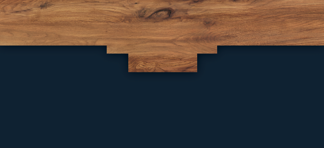
The business card became the starting point for this approach: a dynamic, asymmetrical layout that mimics the rhythm of hand-cut boards and the vertical growth of agave leaves. This visual language extends into the letterhead and envelope, creating a cohesive system where texture and layout carry the brand’s story.
The business card became the starting point for this approach: a dynamic, asymmetrical layout that mimics the rhythm of hand-cut boards and the vertical growth of agave leaves. This visual language extends into the letterhead and envelope, creating a cohesive system where texture and layout carry the brand’s story.
This project focused on: metaphor use | logo creation | layout design ✧ tools: illustrator
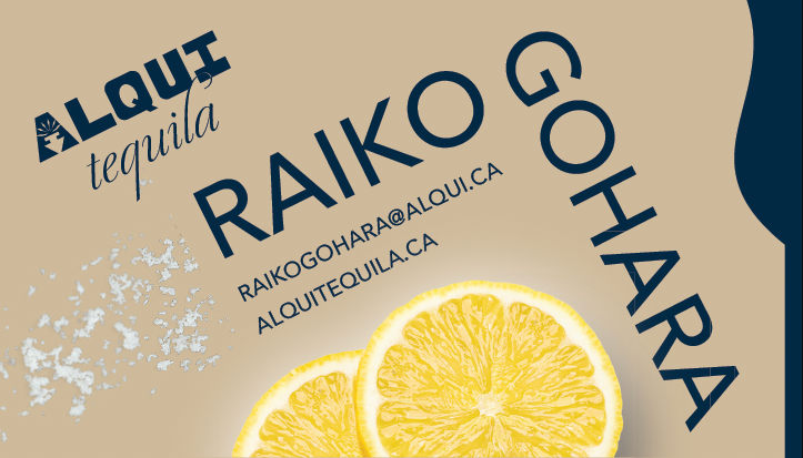
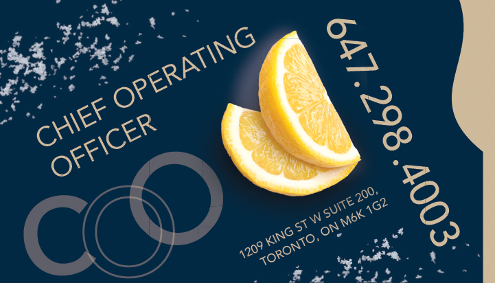
Business Card Back
Business Card Back
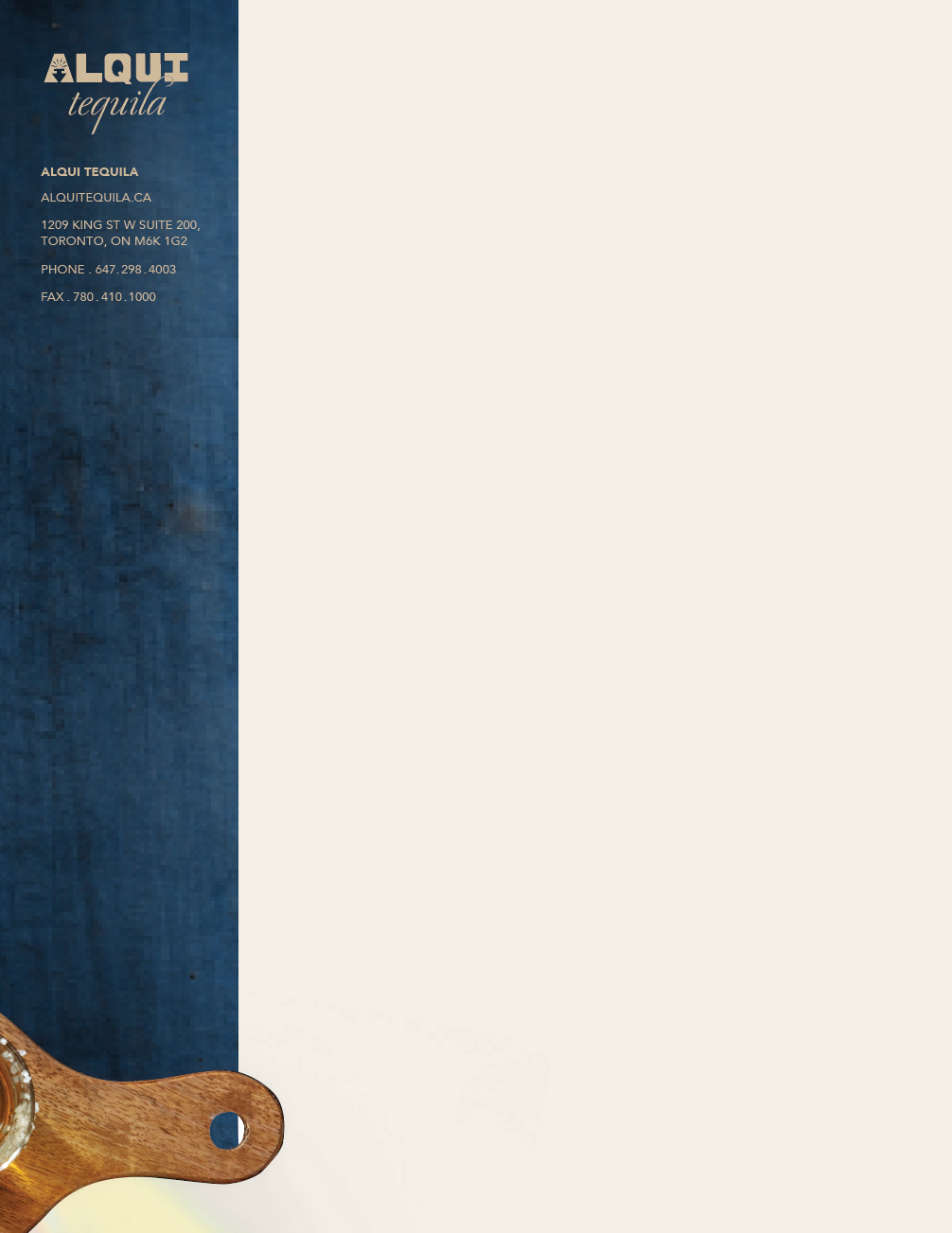
Letterhead
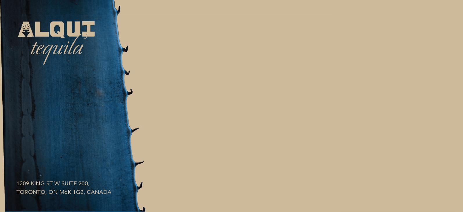
Envelope Front