grind
Branding, Typography, Packaging
Branding, Typography, Packaging
Grind is a café branding project developed to create a cohesive and memorable customer experience across every touchpoint, from exterior signage and menu boards to packaging and promotional materials. Inspired by the craftsmanship behind artisanal baking and specialty coffee, the brand is built around the idea of celebrating the process—from bean to brew and from loaf to layered. Through this project, I gained a deeper understanding of how branding extends beyond a logo and into every customer interaction. It challenged me to think strategically about consistency, usability, environmental design, and how a brand can communicate its values through both visual and physical experiences.
branding exploration ────────────────────────────────────────────────────────────────────────
Brand Identity and elements ────────────────────────────────────────────────────────────────────
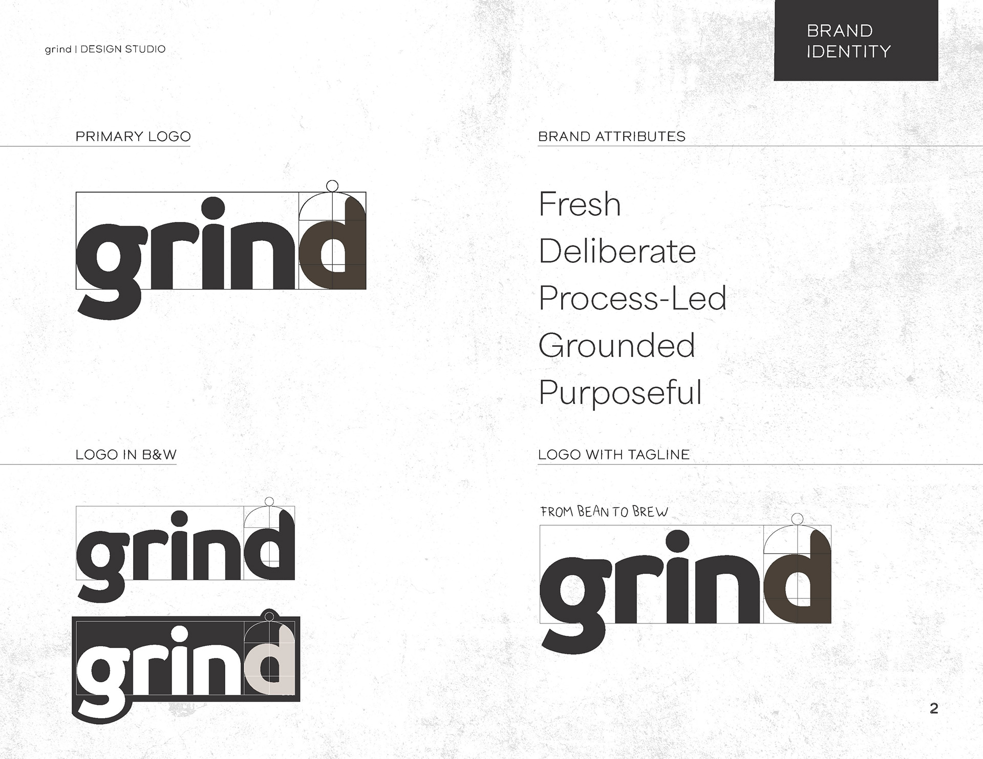
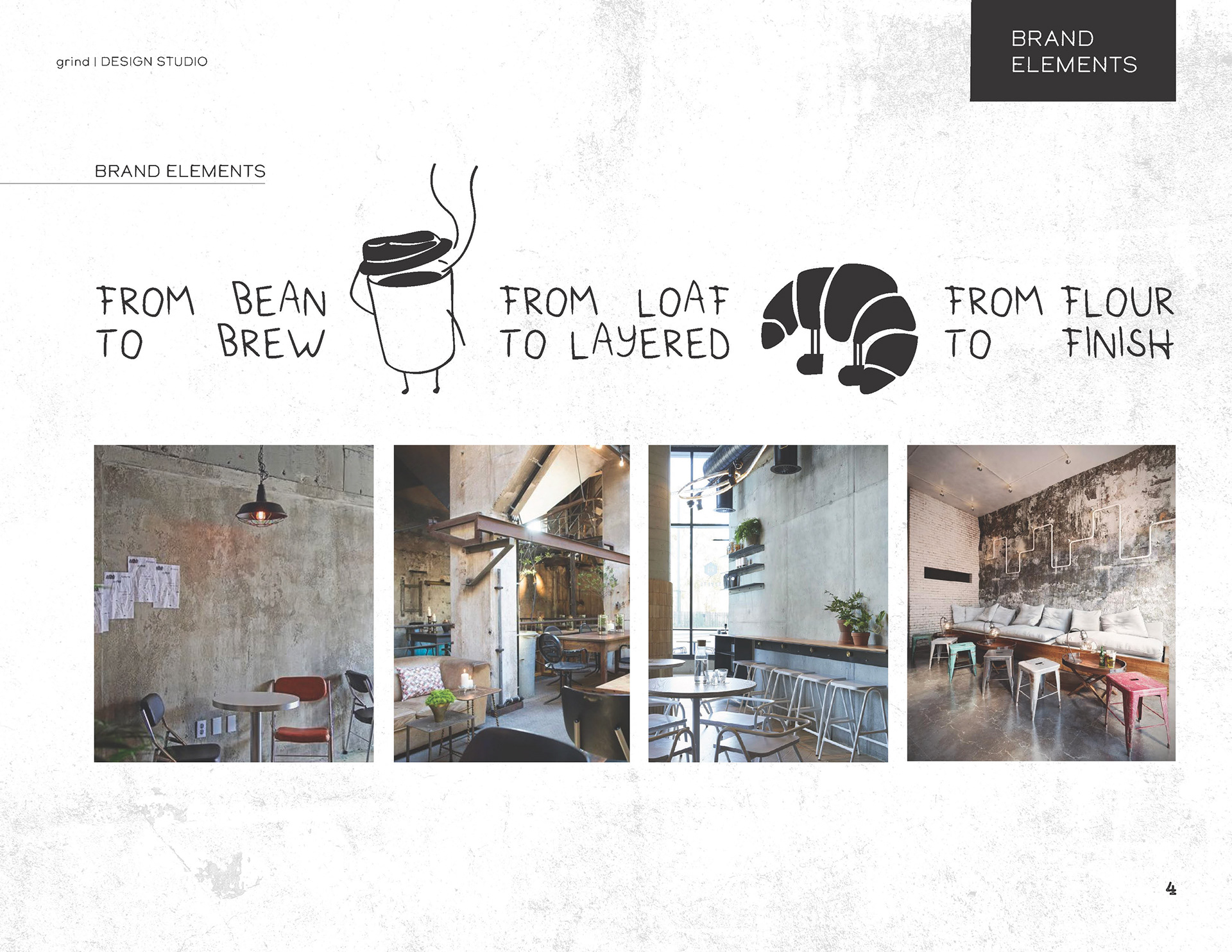
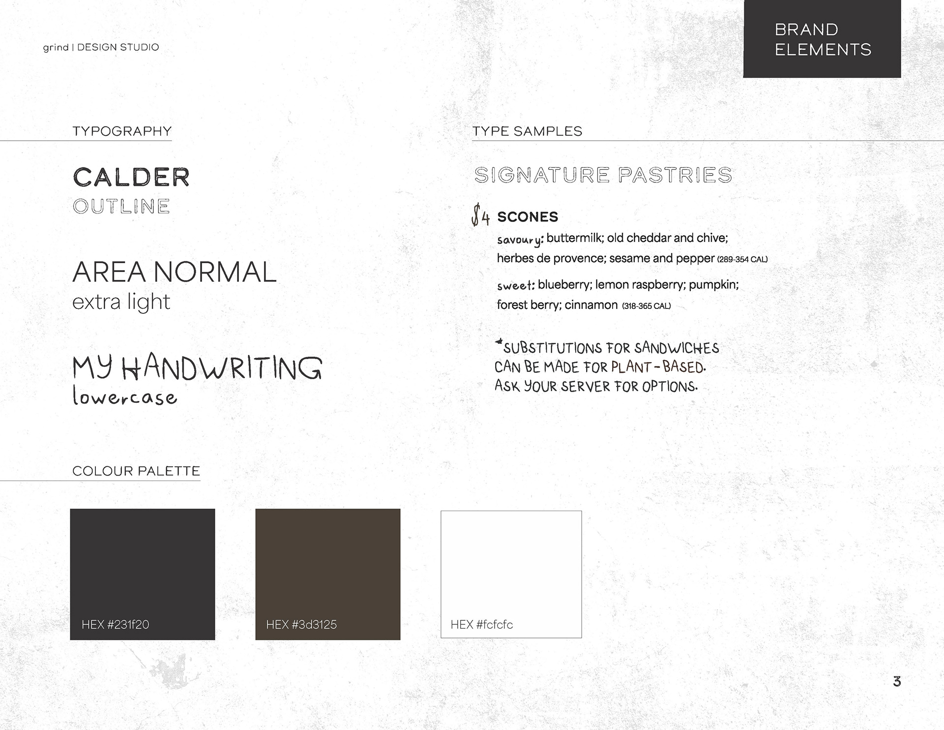
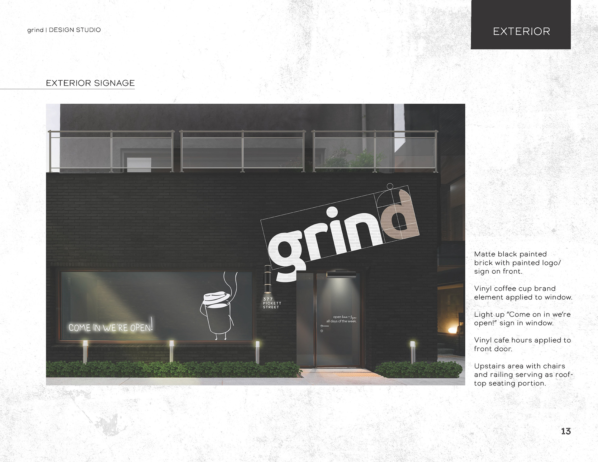
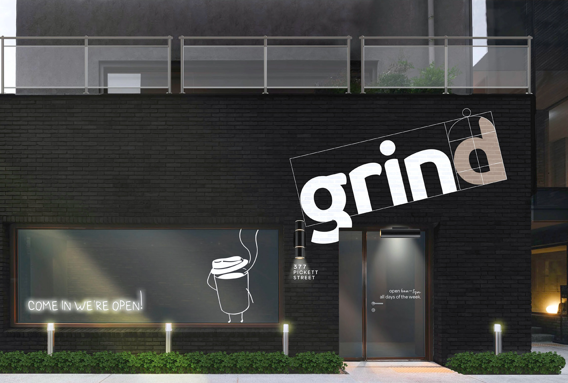
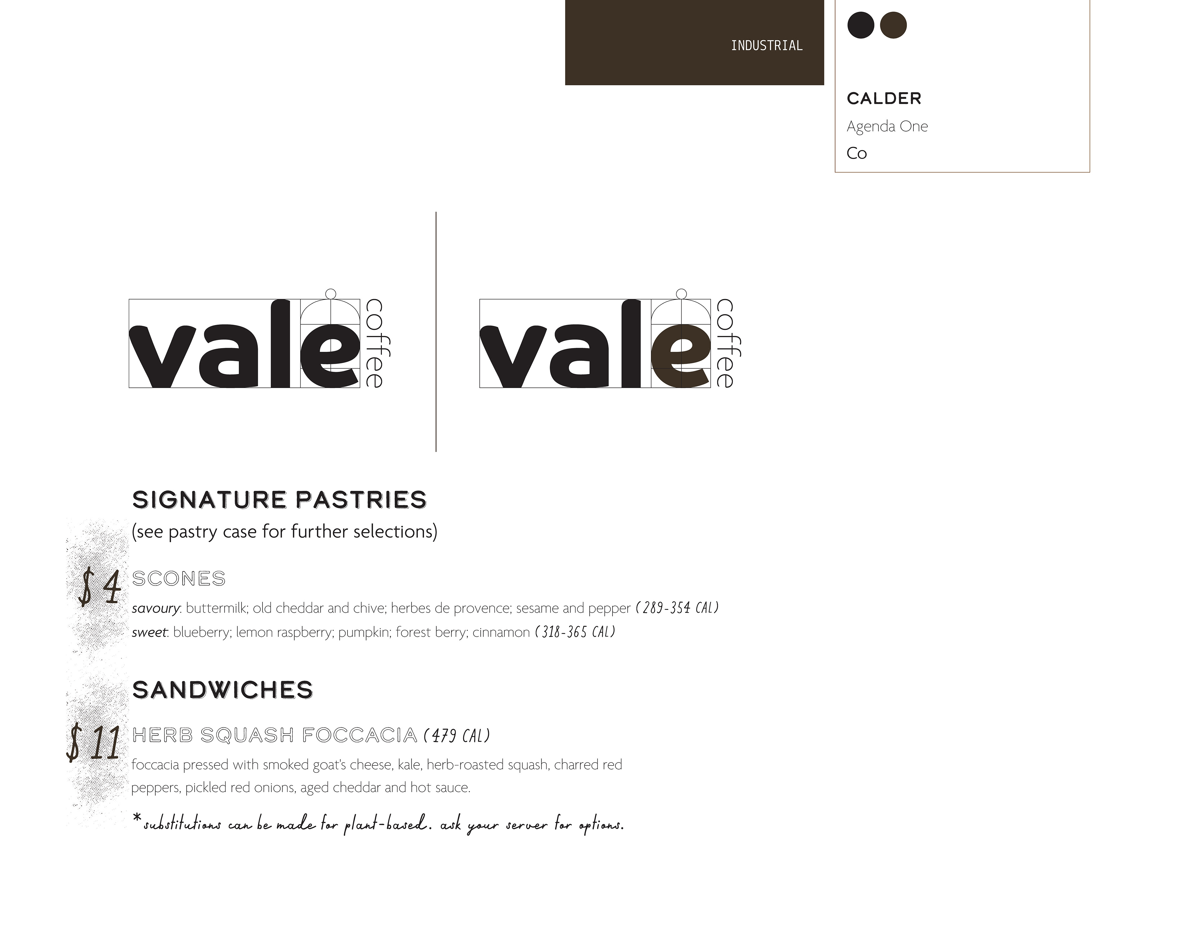
The visual identity is rooted in the café’s industrial aesthetic and commitment to craft. A restrained palette of deep espresso tones and crisp neutrals creates a strong visual foundation, while reflecting the raw materials, precision, and process behind the brand.
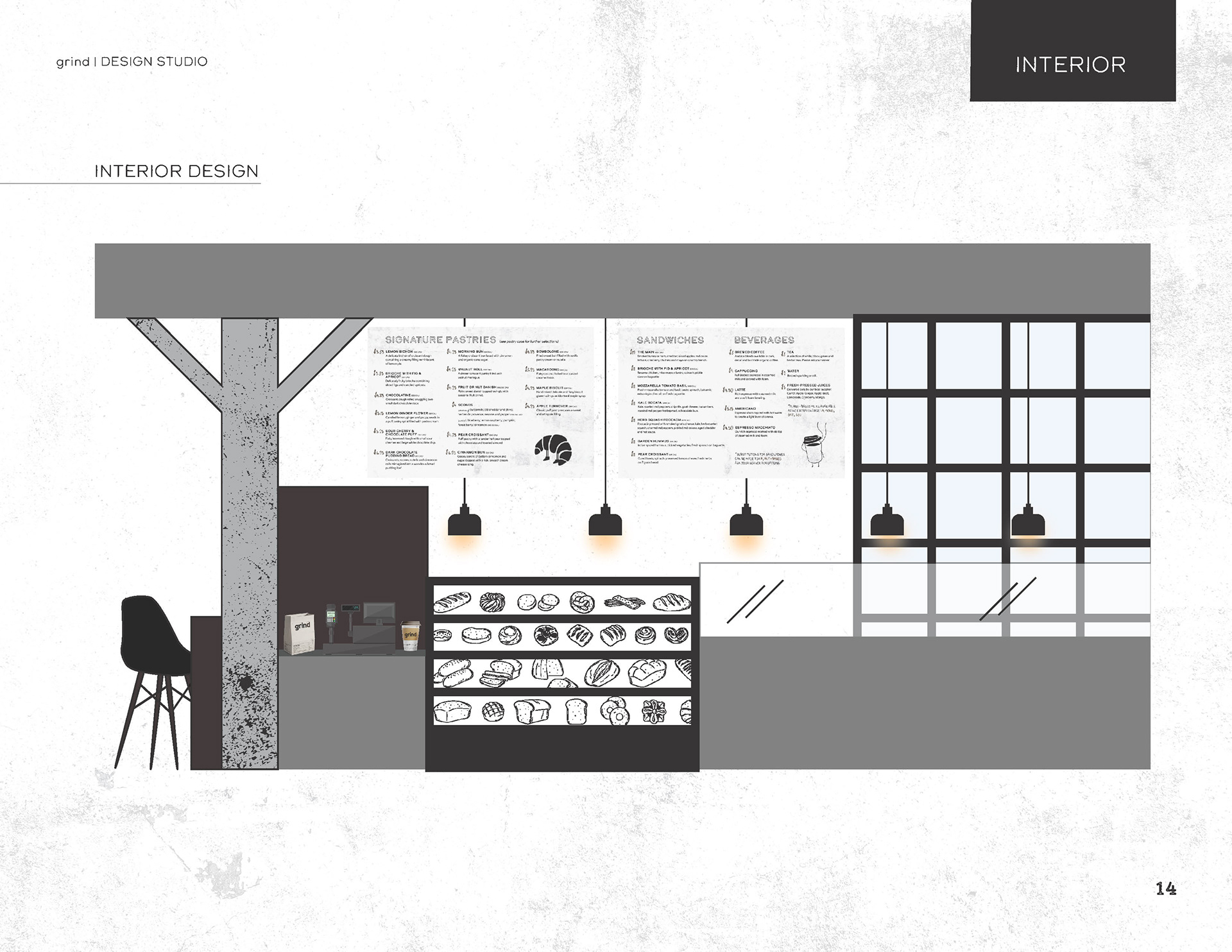
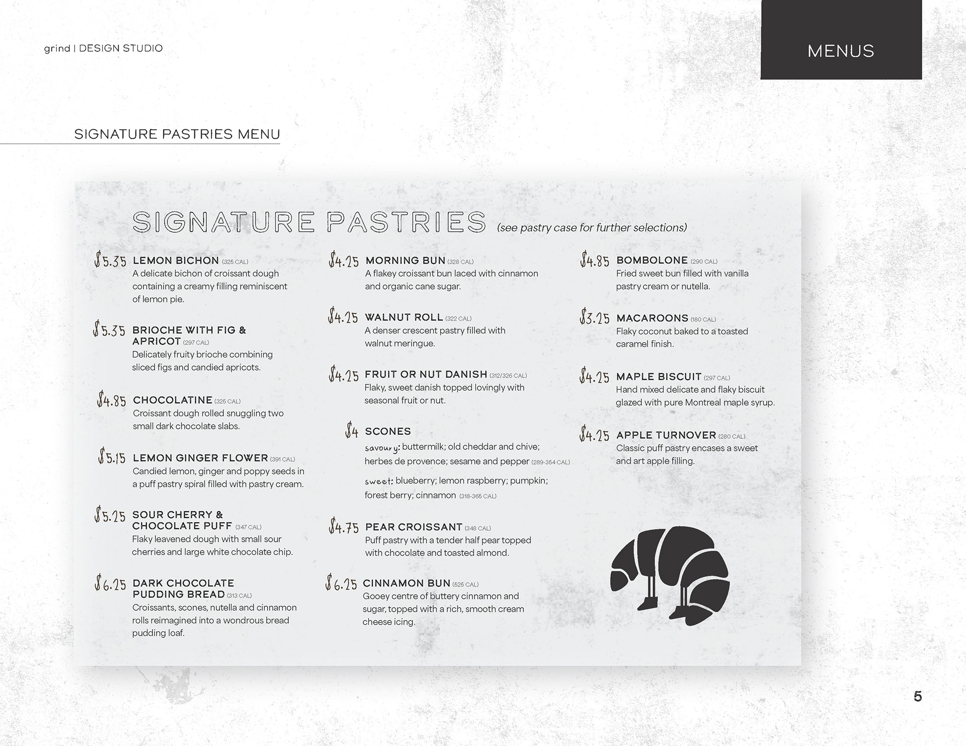
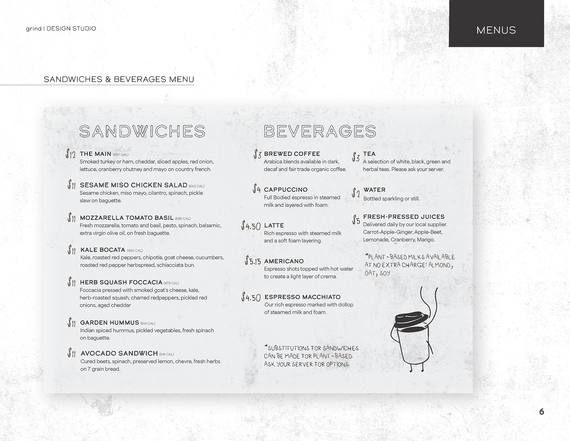
The typography system balances bold character with functional clarity. Distinctive display typography establishes a recognizable presence, while supporting type maintains legibility across menus, signage, and packaging. Together, these elements create a visual language that feels deliberate, grounded, and reflective of the café’s process-driven approach.
Menu Boards ──────────────────────────────────────────────────────────────────────────────
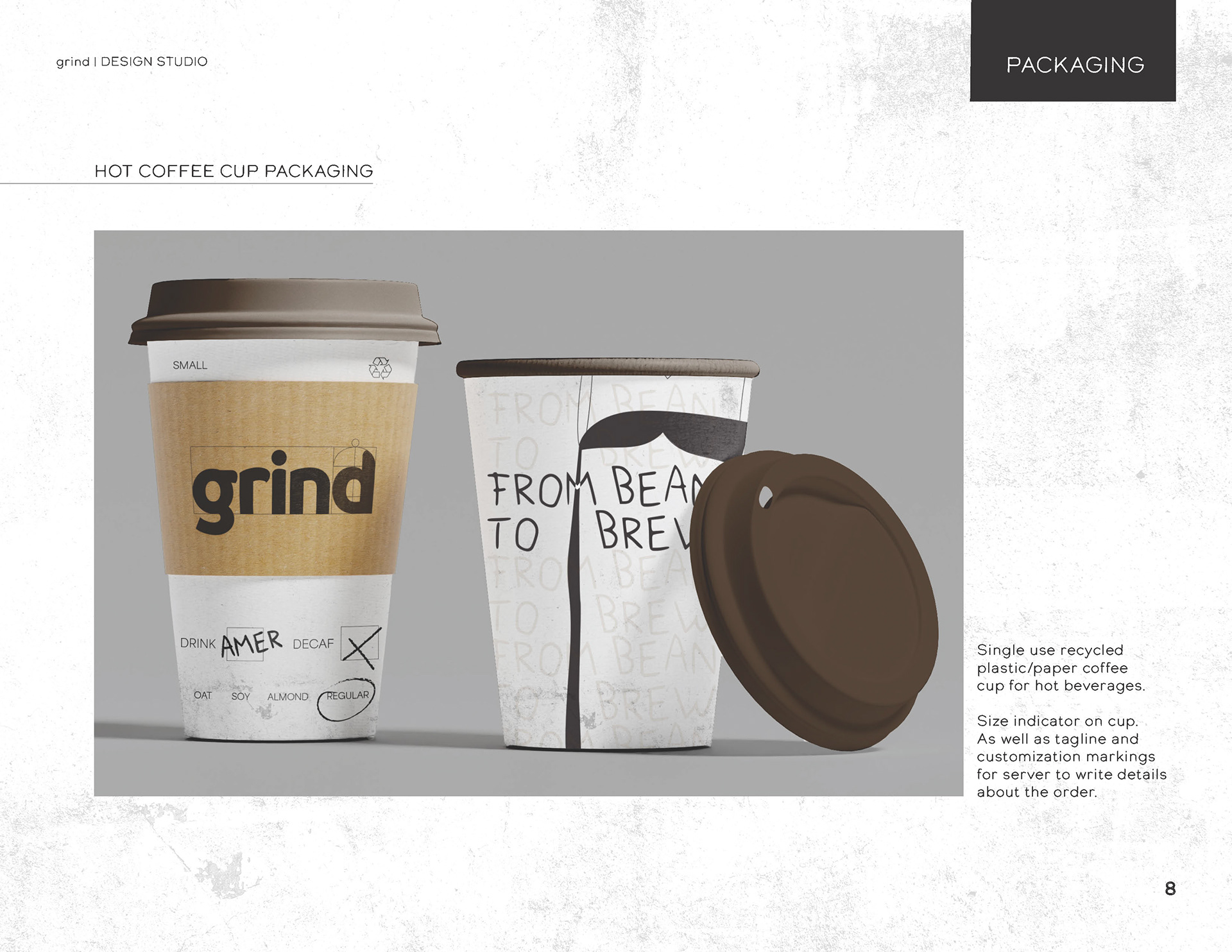
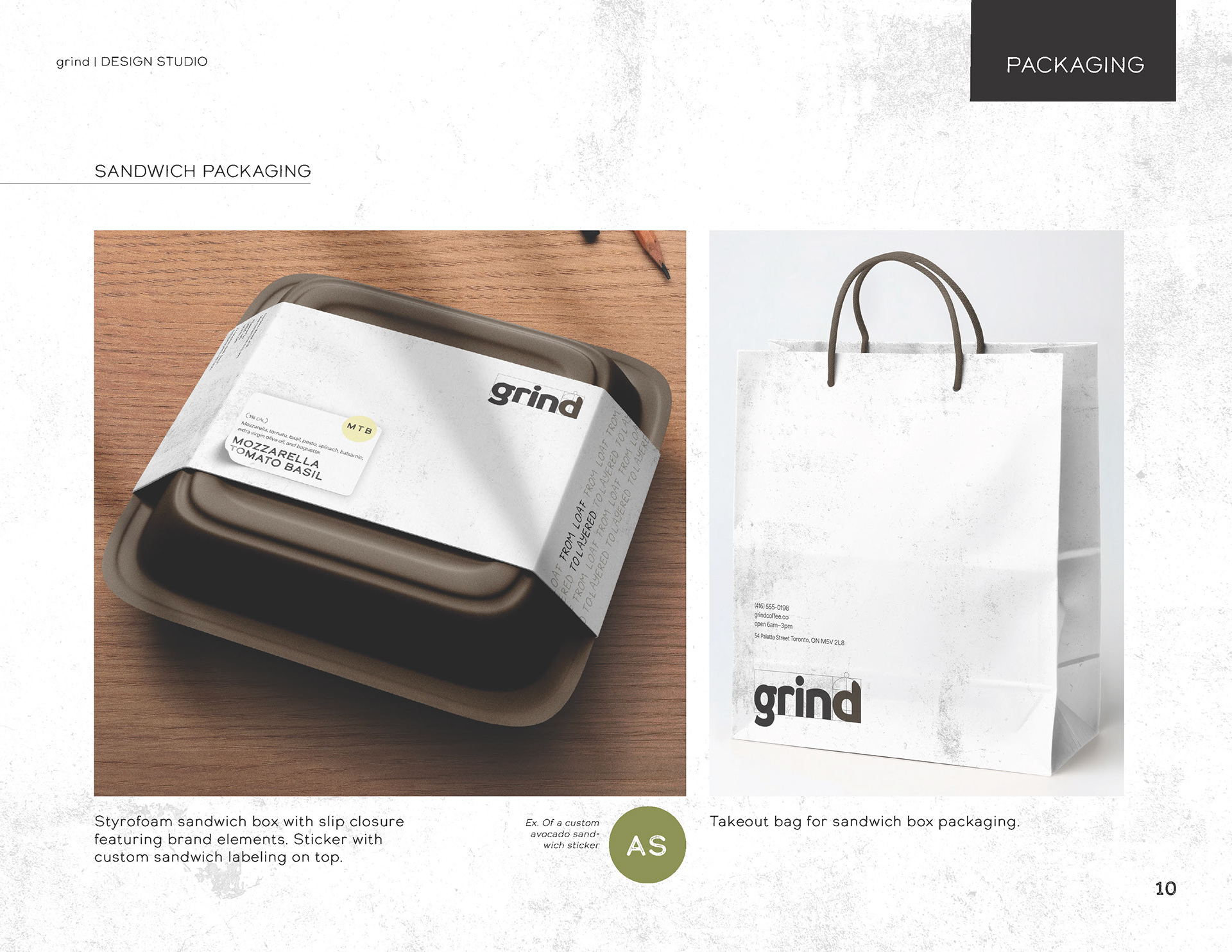
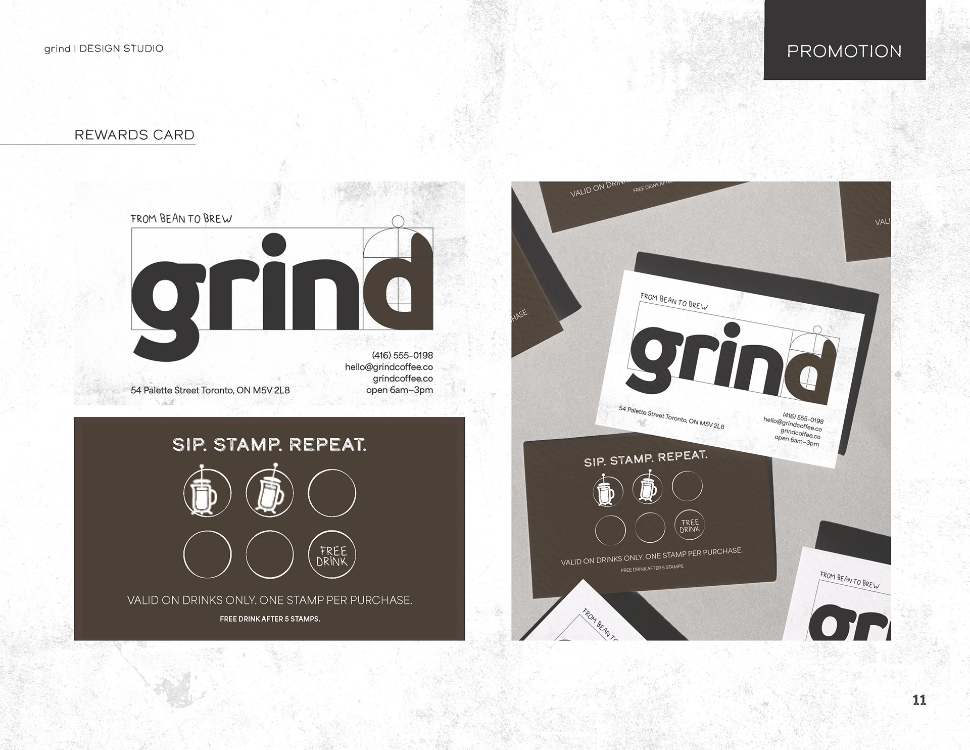
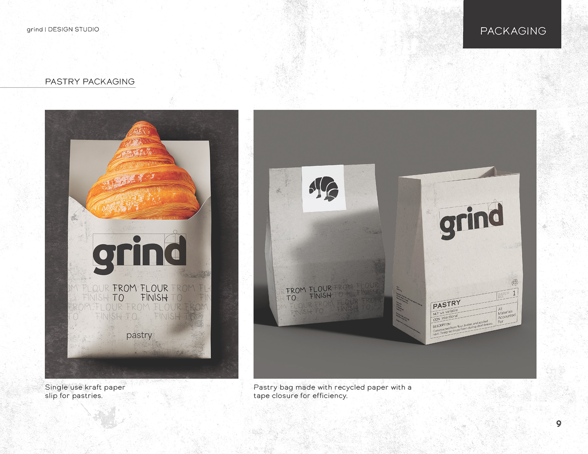
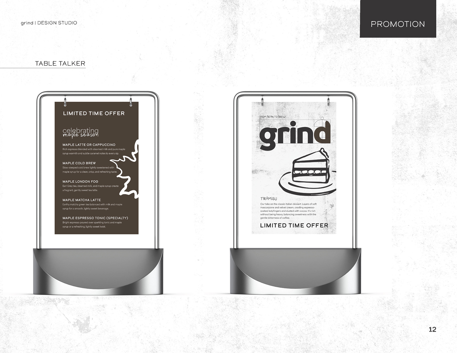
Packaging and Promotion ─────────────────────────────────────────────────────────────────────
Design and signage ──────────────────────────────────────────────────────────────────────────