
SôcôLa Chocolate
Packaging, Branding, Typography, AI Prompting
Packaging, Branding, Typography, AI Prompting
For this project, I developed a sustainable packaging system for SôcôLa, an organic chocolate brand committed to ethical sourcing and environmental responsibility. Through thoughtful material selection, culturally inspired branding, and AI-generated flavour imagery, the goal was to create packaging that feels both premium and approachable while reflecting the brand’s values. The main objective of this project was to create packaging that reflects the brand’s commitment to sustainability, ethical sourcing, and high-quality ingredients, while also standing out as a premium product. Another key goal was to use and experiment with generative AI, creating a feature image of the chocolate and its highlighted flavours.
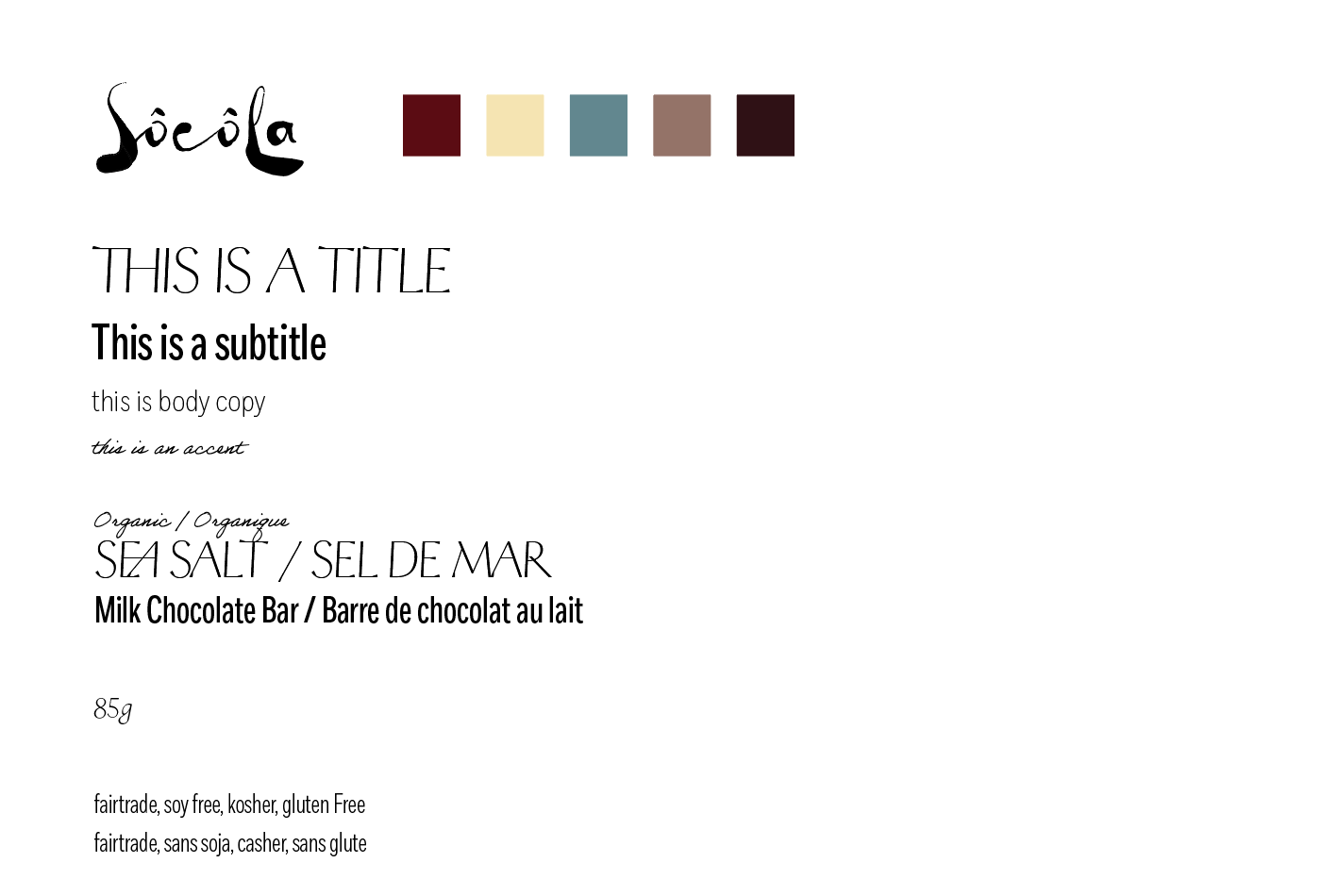
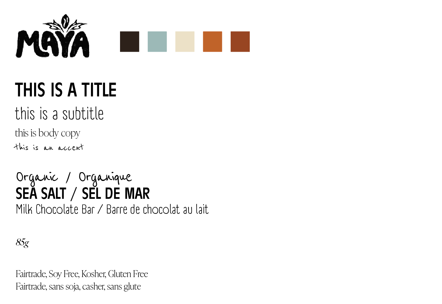
branding exploration ───────────────────────────────────────────────────────────────────────
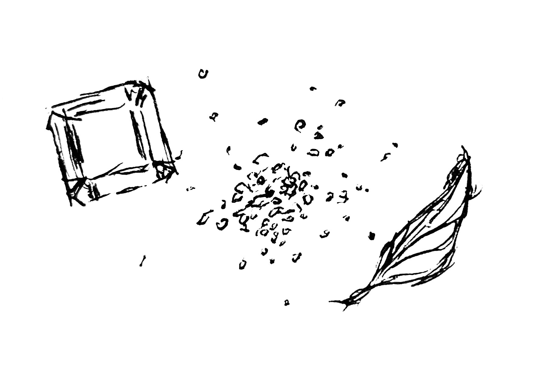
Ai Prompt Exploration ────────────────────────────────────────────────────────────────────────
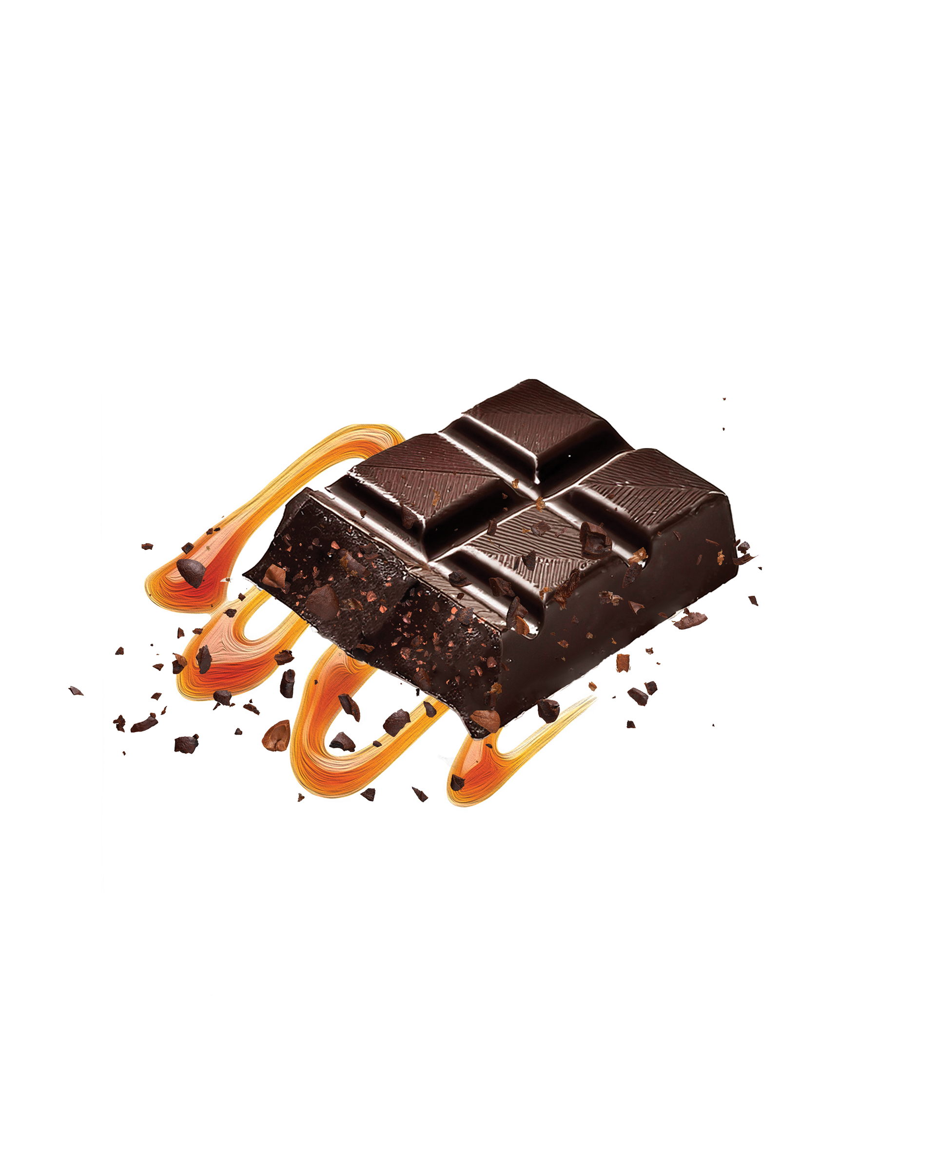
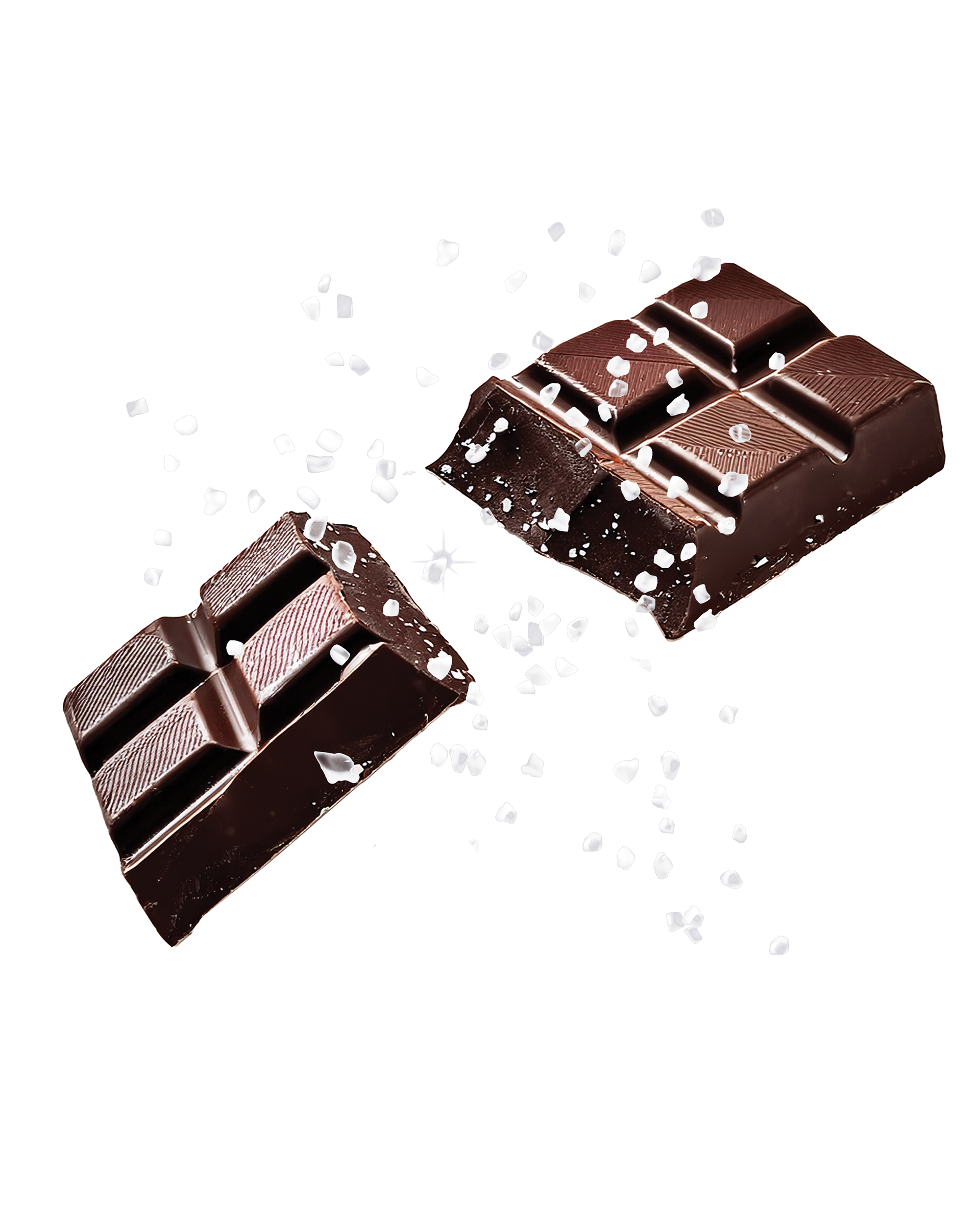
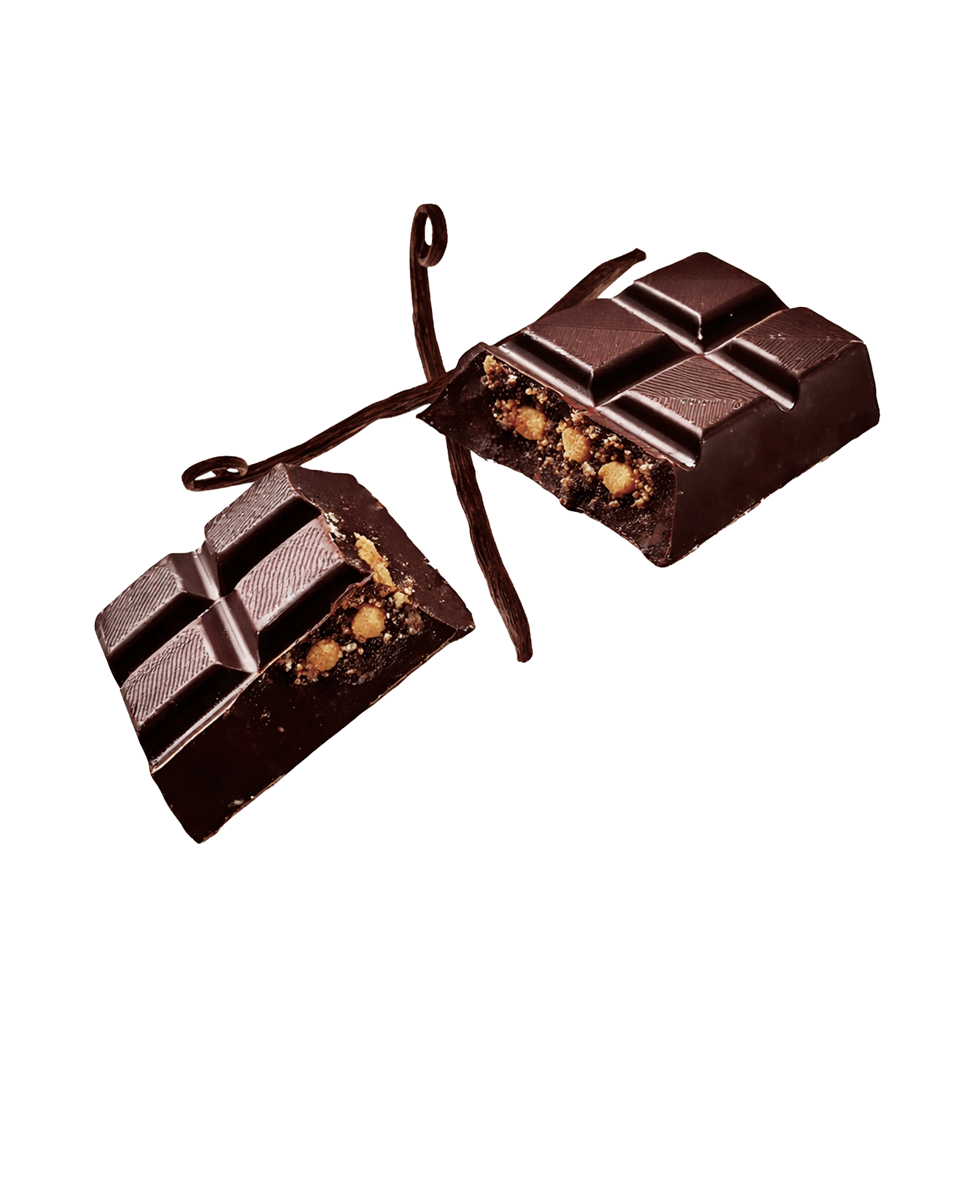
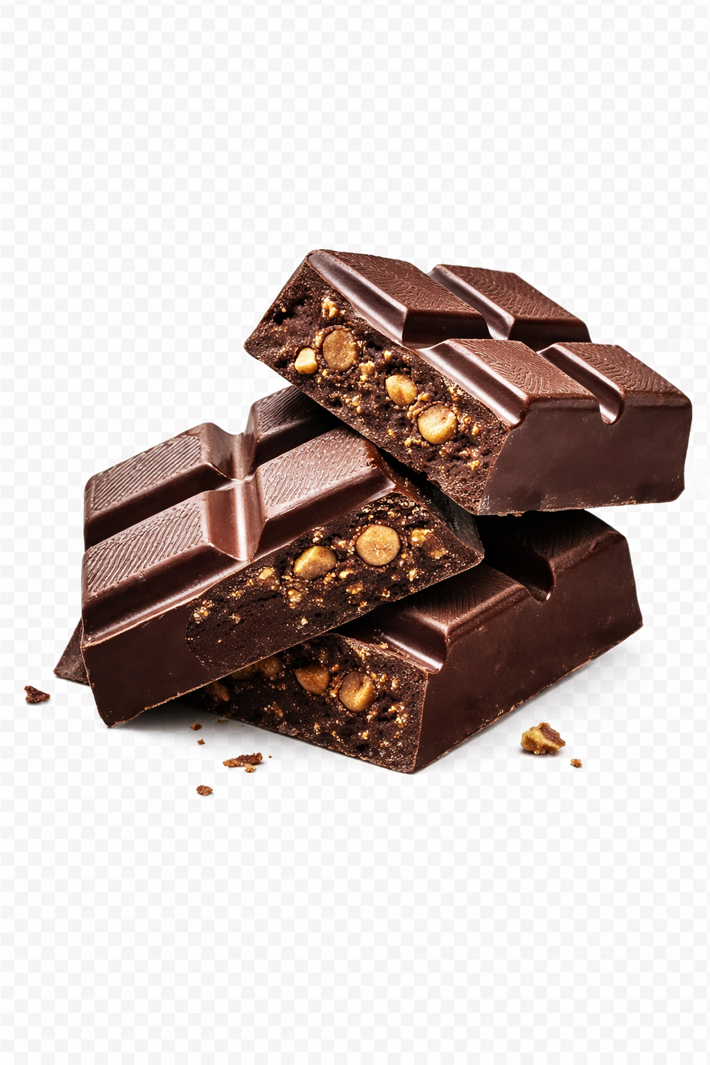
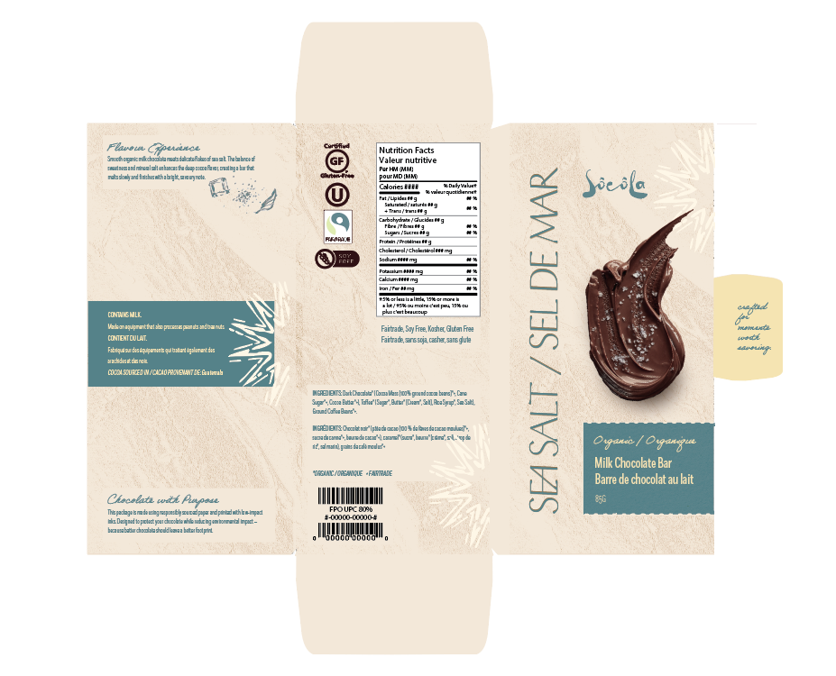
For the generative AI, I achieved this by using generative AI in Photoshop, combining targeted keywords and reference images to guide the prompts. This helped produce feature imagery that accurately represents the chocolate’s flavours while aligning with the brand’s visual identity.
textures and illustrations ────────────────────────────────────────────────────────────────────

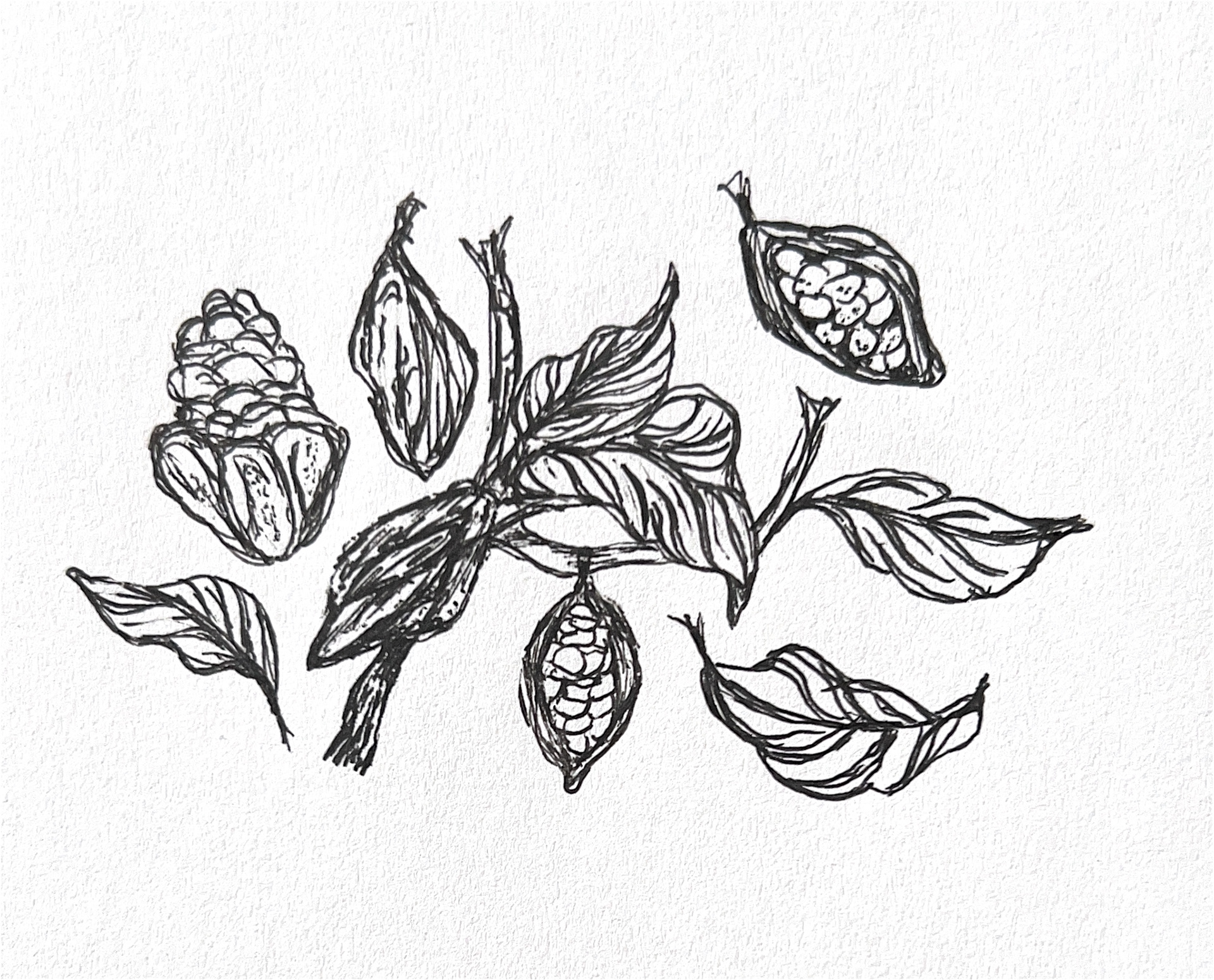

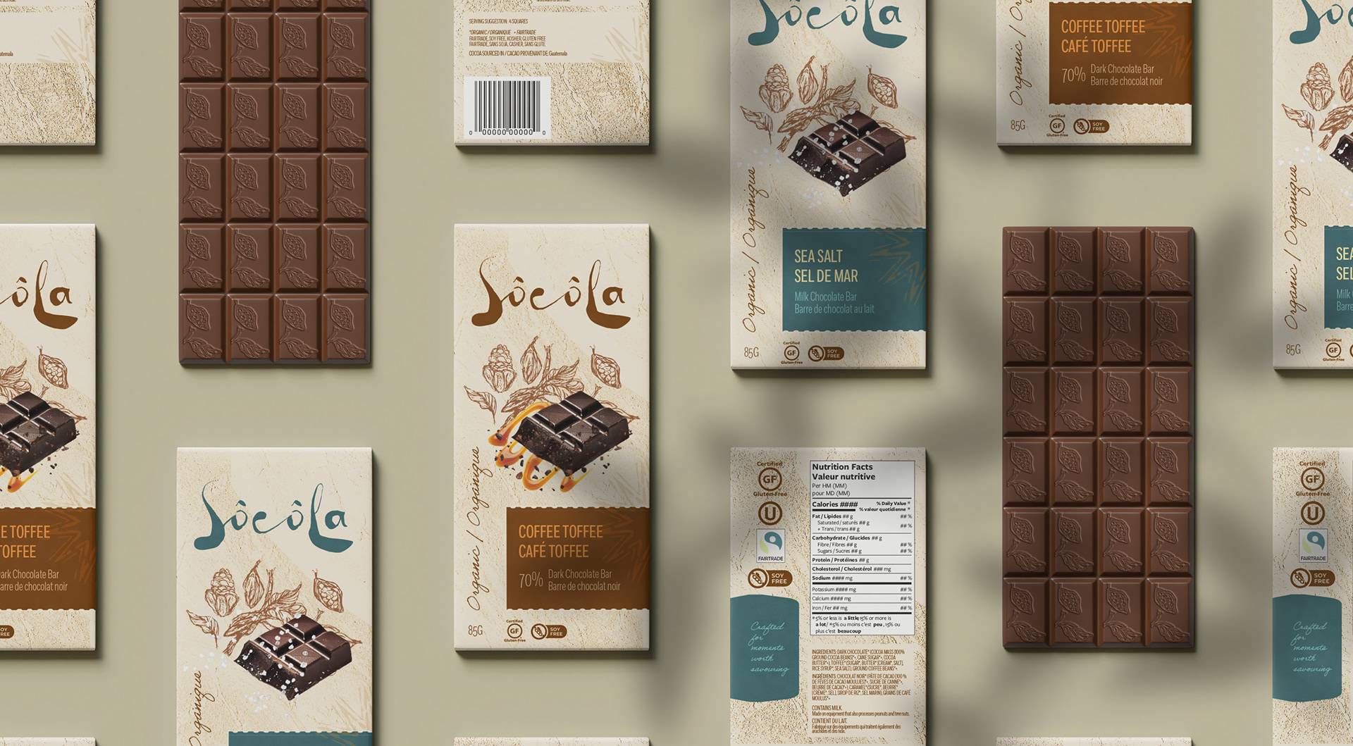
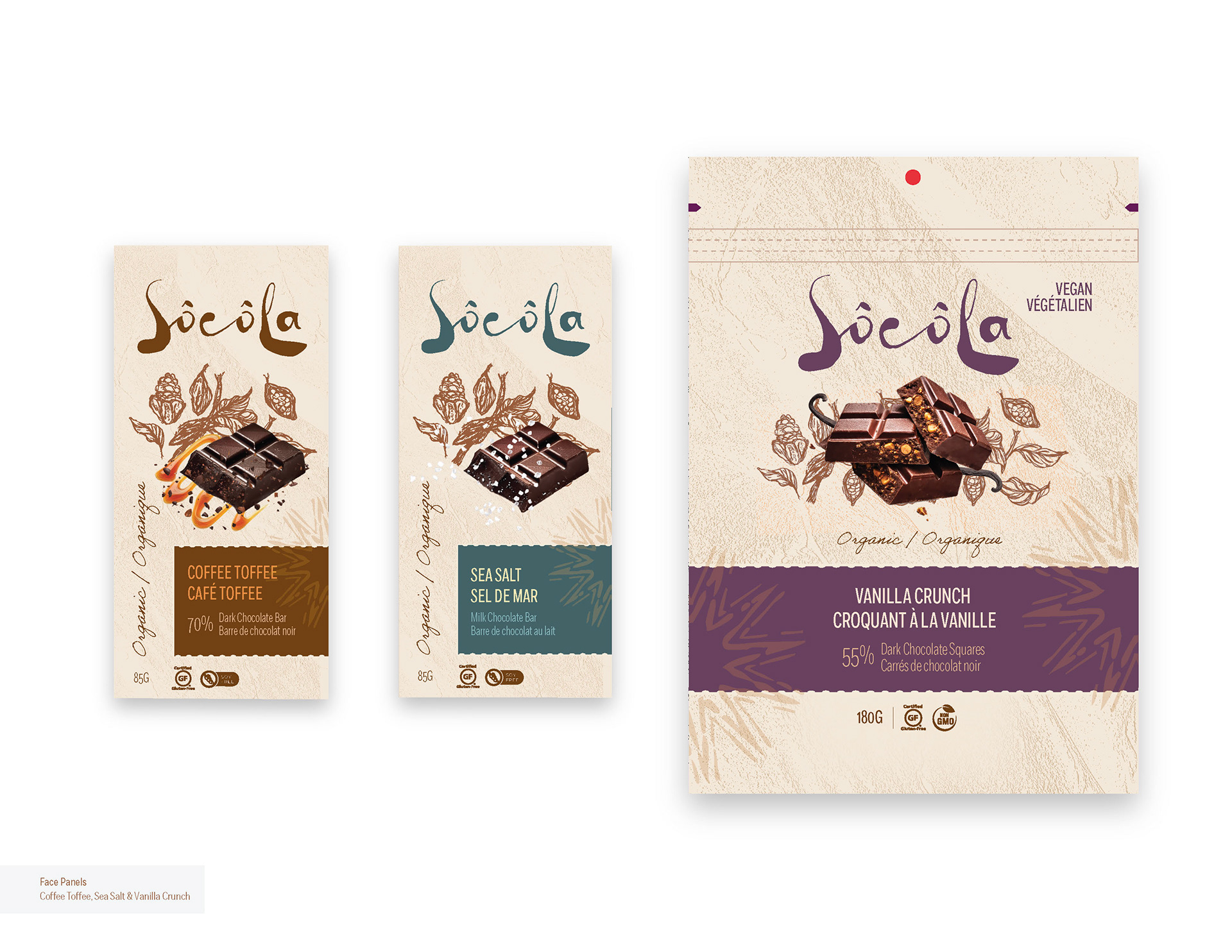
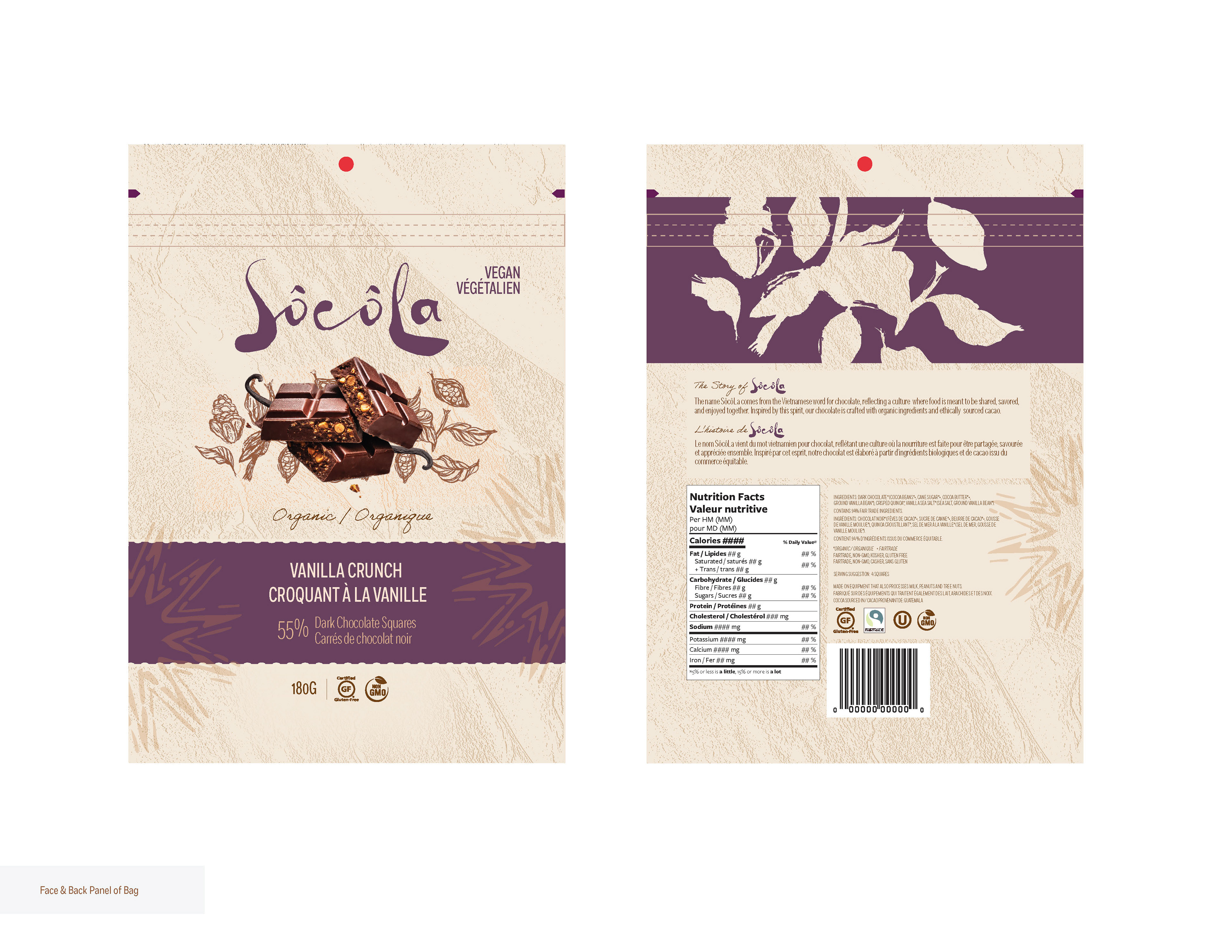
To create a sense of authenticity and craftsmanship, I incorporated hand-drawn illustrations and layered textures throughout the packaging system. The organic linework adds a human touch that contrasts the refined typography, while the subtle textures evoke natural materials and the journey from cacao bean to chocolate bar. These elements help communicate the brand’s artisanal values and create a visual experience that feels both premium and approachable.
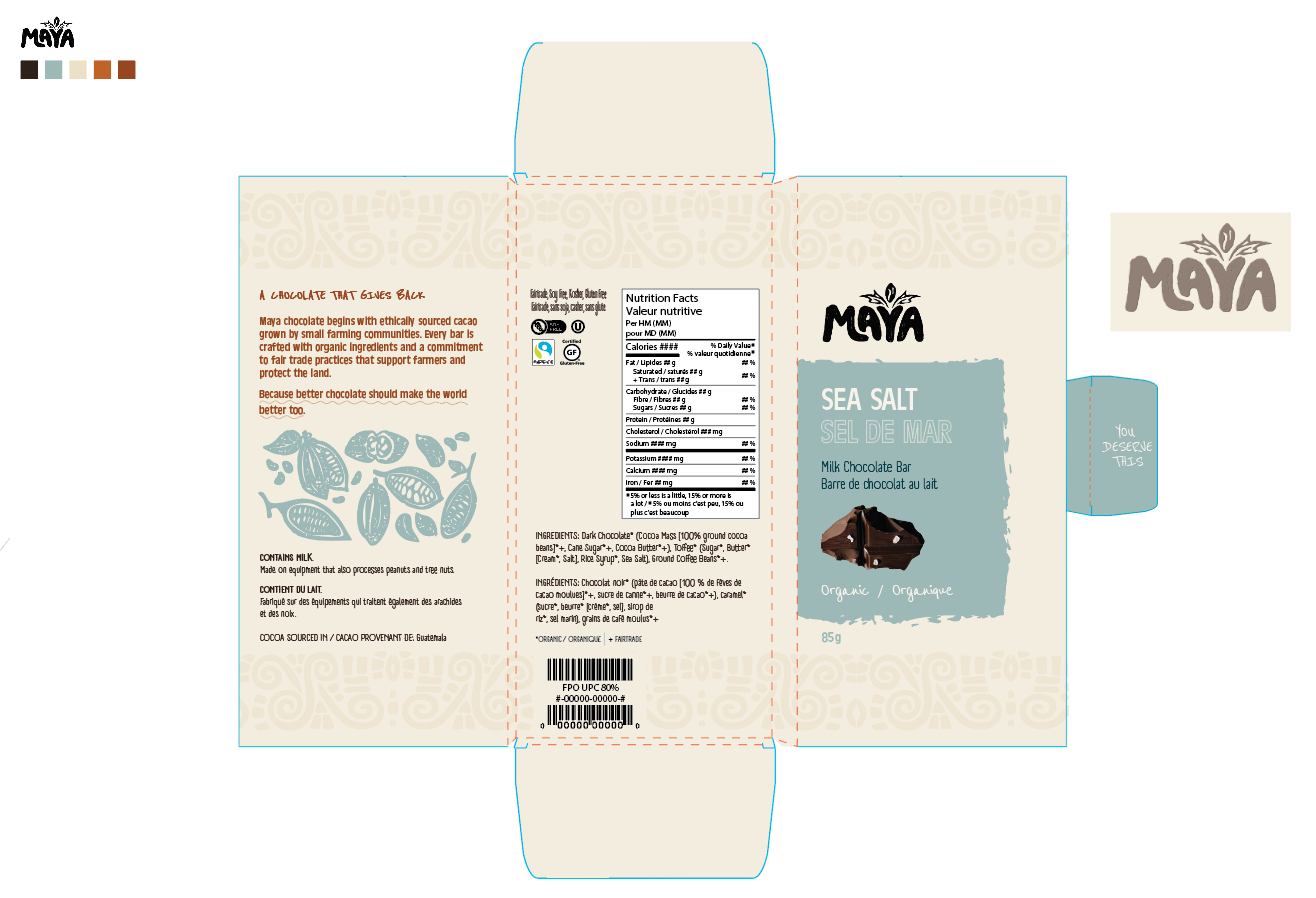
Bar Dielines ─────────────────────────────────────────────────────────────────────────────
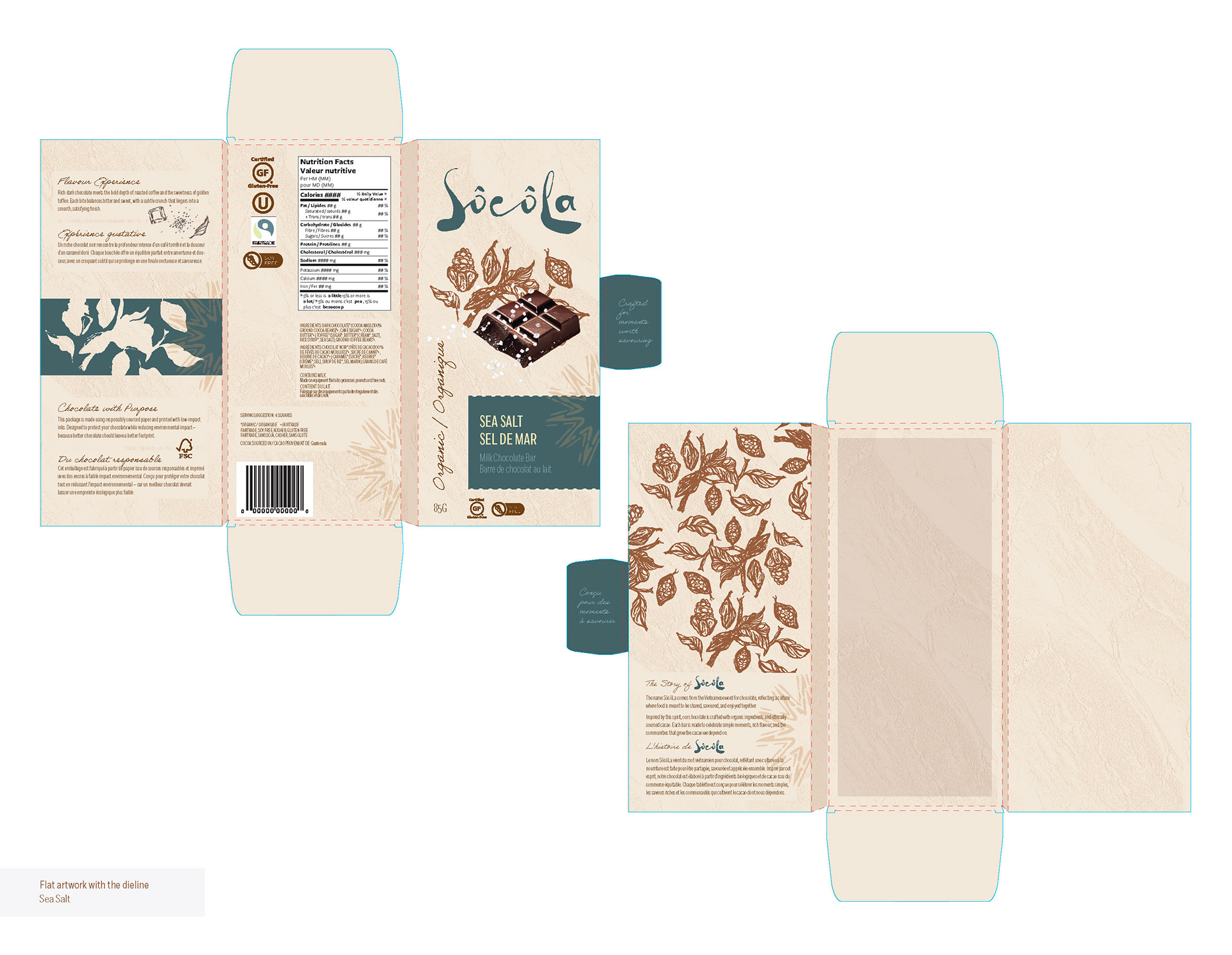
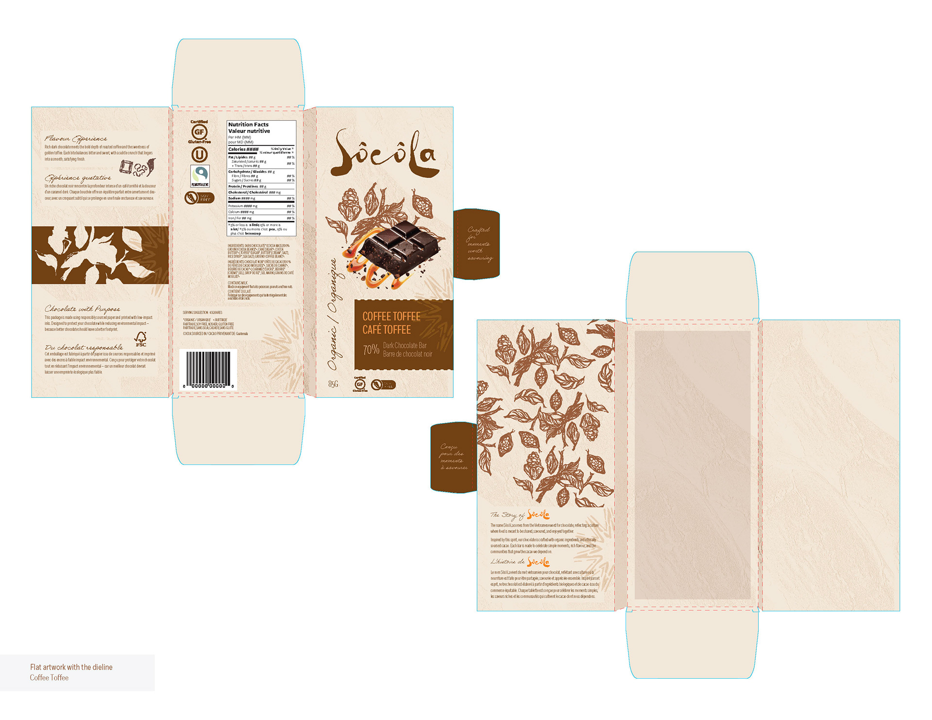
An important part of the concept development came from researching the brand name “SôcôLa,” which I discovered is derived from the Vietnamese word for chocolate. This insight informed several design decisions. I incorporated type choices inspired by Vietnamese script for the title treatment, along with subtle graphic elements and textures that reference Vietnamese culture.
Face Panels ──────────────────────────────────────────────────────────────────────────────
Gusset Bag Dieline ─────────────────────────────────────────────────────────────────────────
Mockup ────────────────────────────────────────────────────────────────────────────────
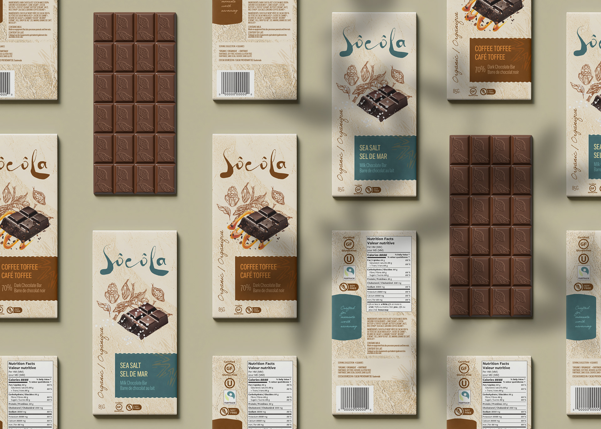
Sustainability was also a major focus in both design and material choices. The packaging uses a paper-based system, including a foldable paperboard outer carton and a recyclable fibre-based inner wrap, which eliminates the need for plastic or foil. This aligns directly with the brand’s mission to reduce environmental impact while maintaining functionality and product protection.