────────────✧────────────
This project explores branding and editorial design through the creation of a fictional, eco-conscious paint company aimed at the wholesale retail market. I designed the TerraHue logo to feel established and professional, balancing organic references with a bold, contemporary word mark suitable for in-store environments.
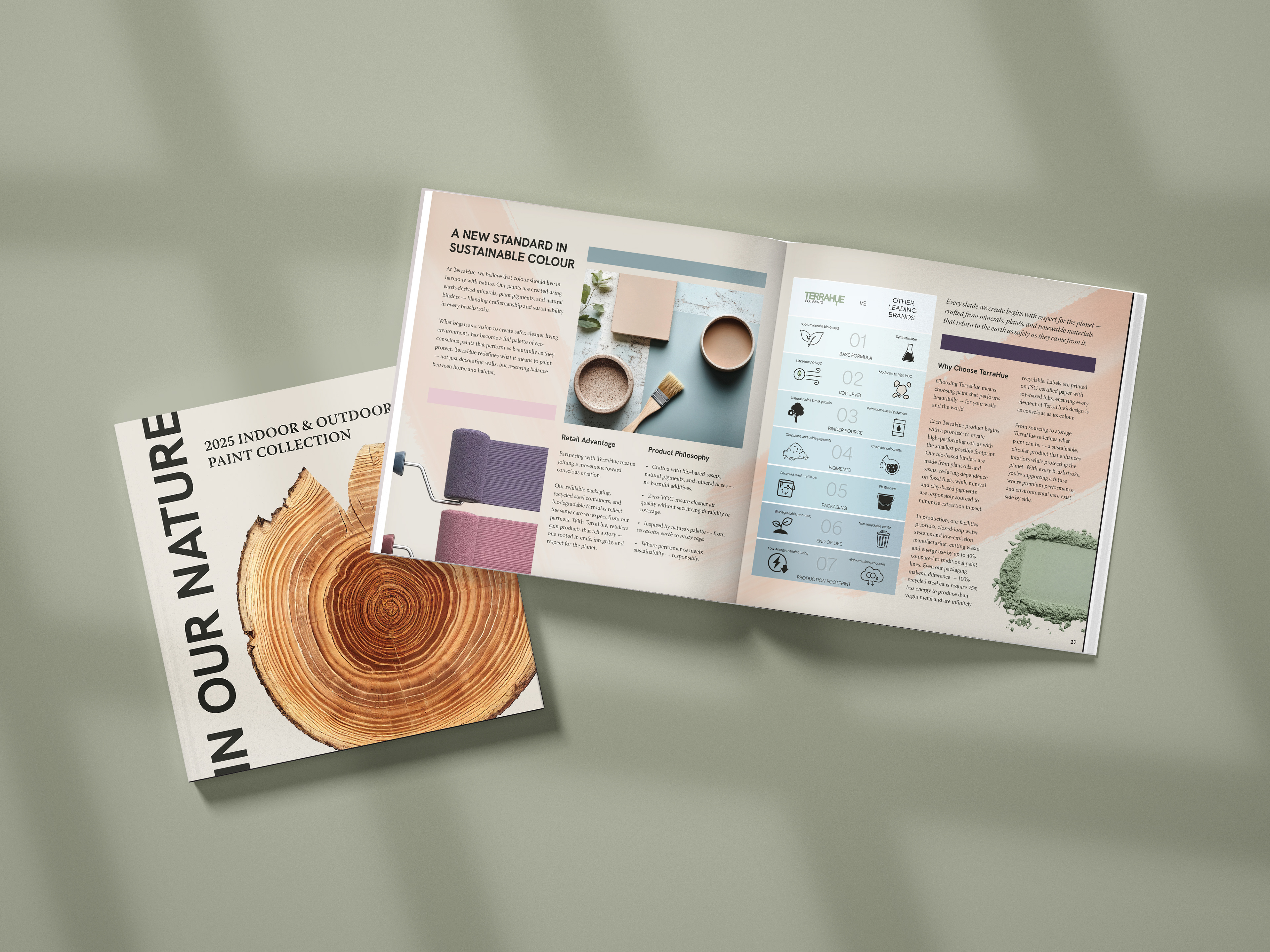
The 7×7-inch brochure is structured on a clean, modular grid system, ensuring clarity, hierarchy, and consistency across spreads. The cover centers on the metaphor “In Our Nature,” visualized through a wooden stump/paint palette shape communicates sustainability without depicting the product directly. Inside, editorial layouts combine imagery, typography, and spacing to guide the reader seamlessly through the content.
A custom comparison infographic contrasts TerraHue with leading paint brands, translating sustainability data into accessible, original visuals designed specifically for this format. The project emphasizes thoughtful brand storytelling, information design, and print-ready execution, resulting in a cohesive promotional piece that feels refined, credible, and market-ready.
This project focused on: information design | brand storytelling | metaphors ✧ tools: illustrator | photoshop
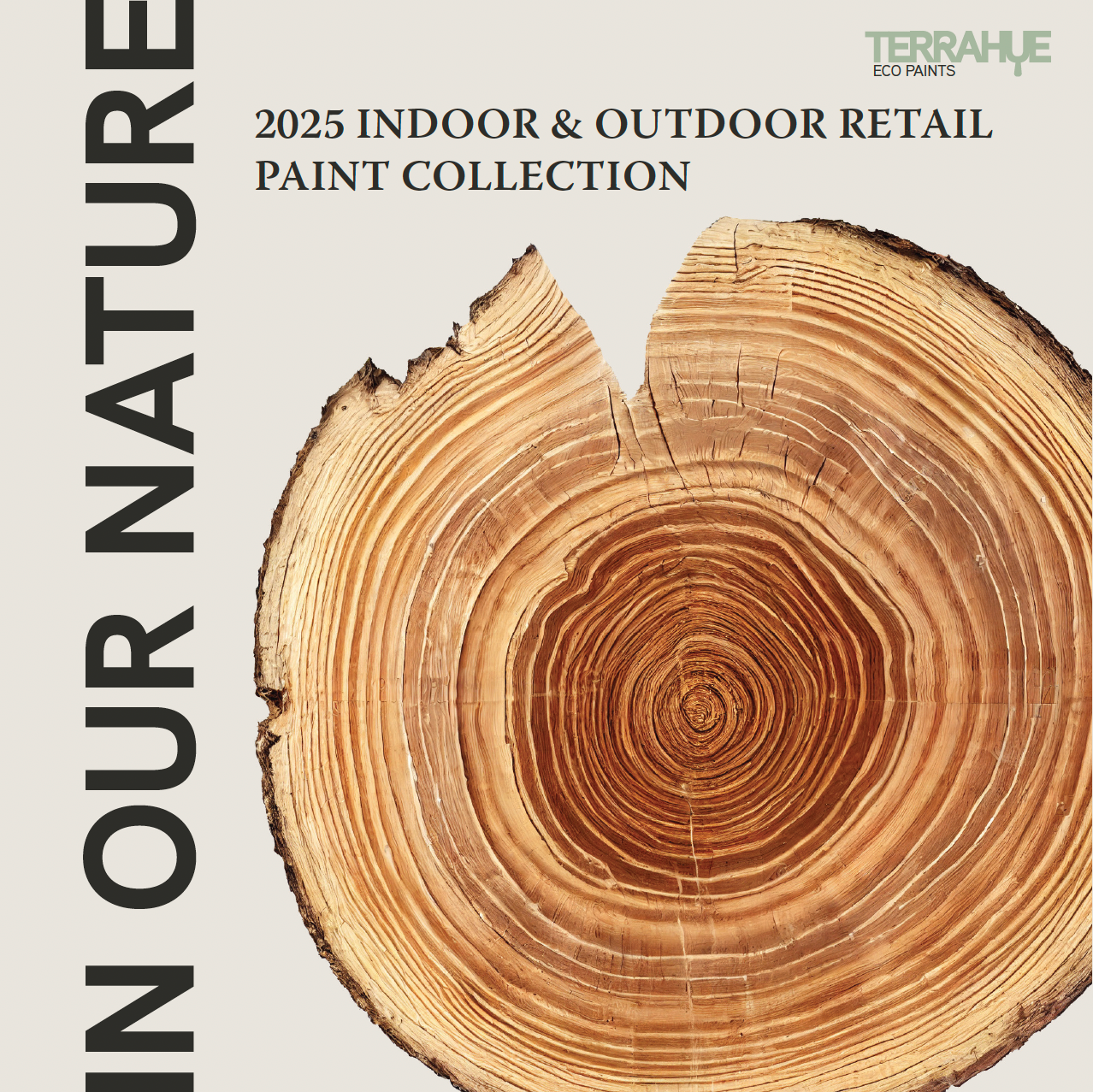
Front Cover
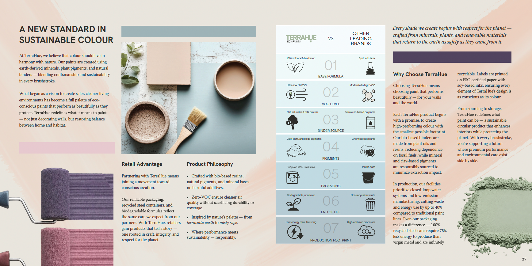
Inside Spread
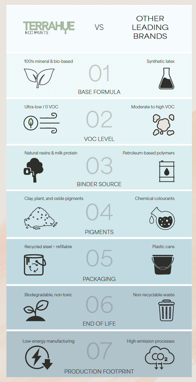
Infographic
Company Logo