The Dalhousie Gazette
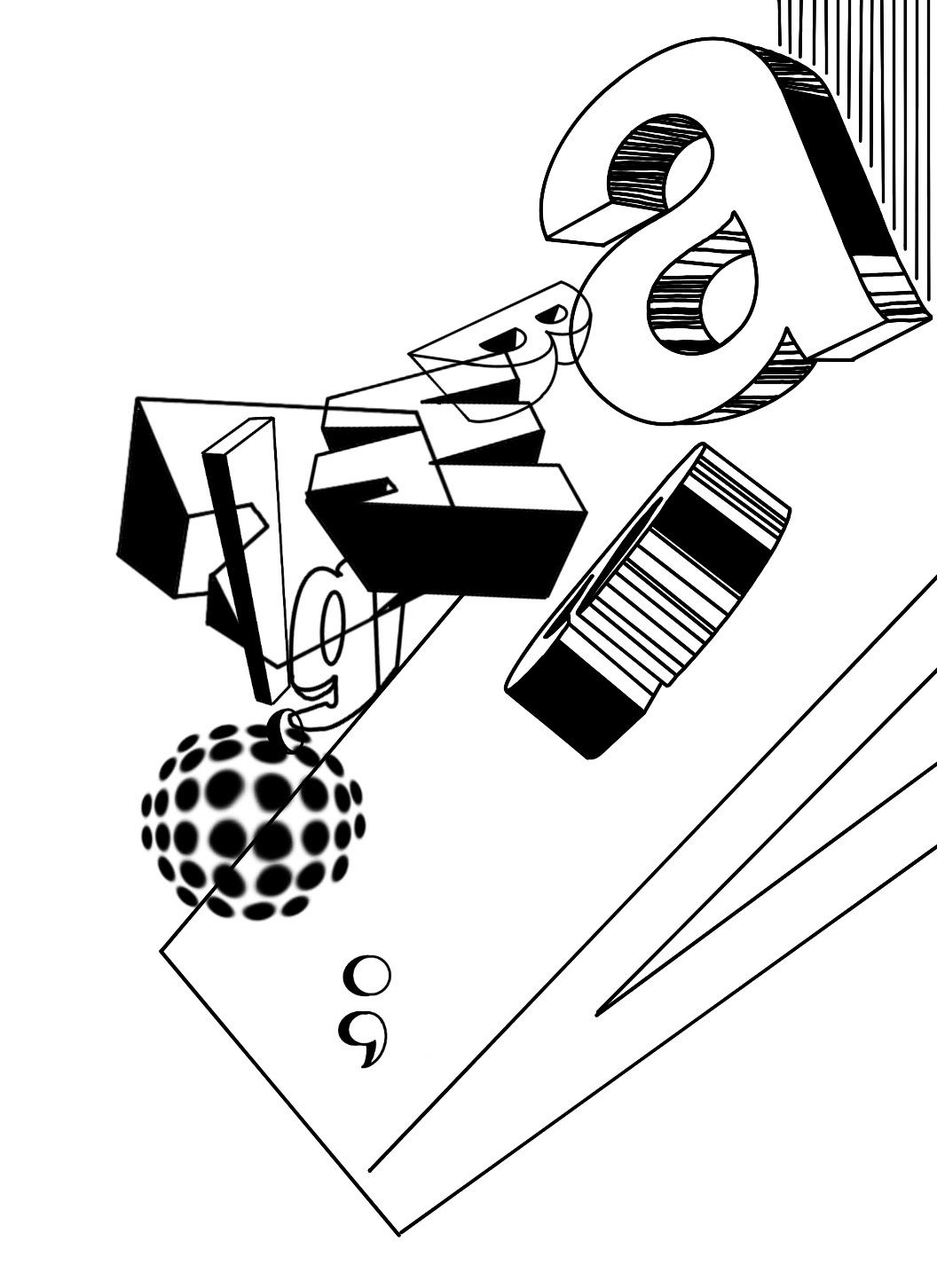
Editorial, Typography
Editorial, Typography
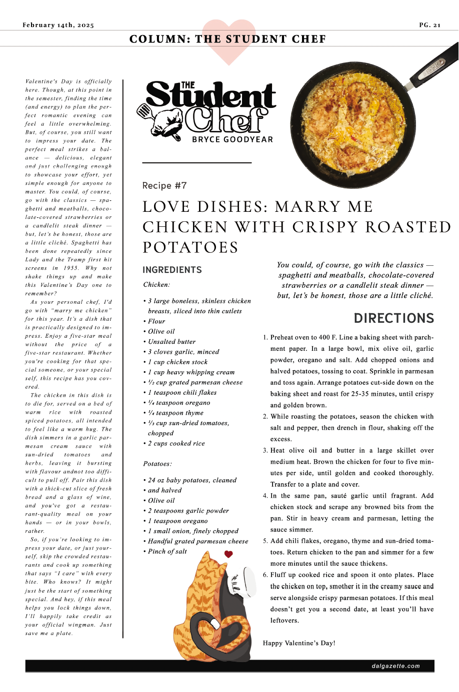
As a layout and graphic designer for the Dalhousie Gazette — the student publication of Dalhousie University — I spent two years translating written content into print experiences that were clear, considered, and visually compelling. Each bi-weekly issue demanded the design of a full 24-page layout, balancing editorial hierarchy, grid consistency, and readability across a range of story types and formats. Working closely alongside the editorial team, every spread was an exercise in making content not just legible, but worth lingering on.
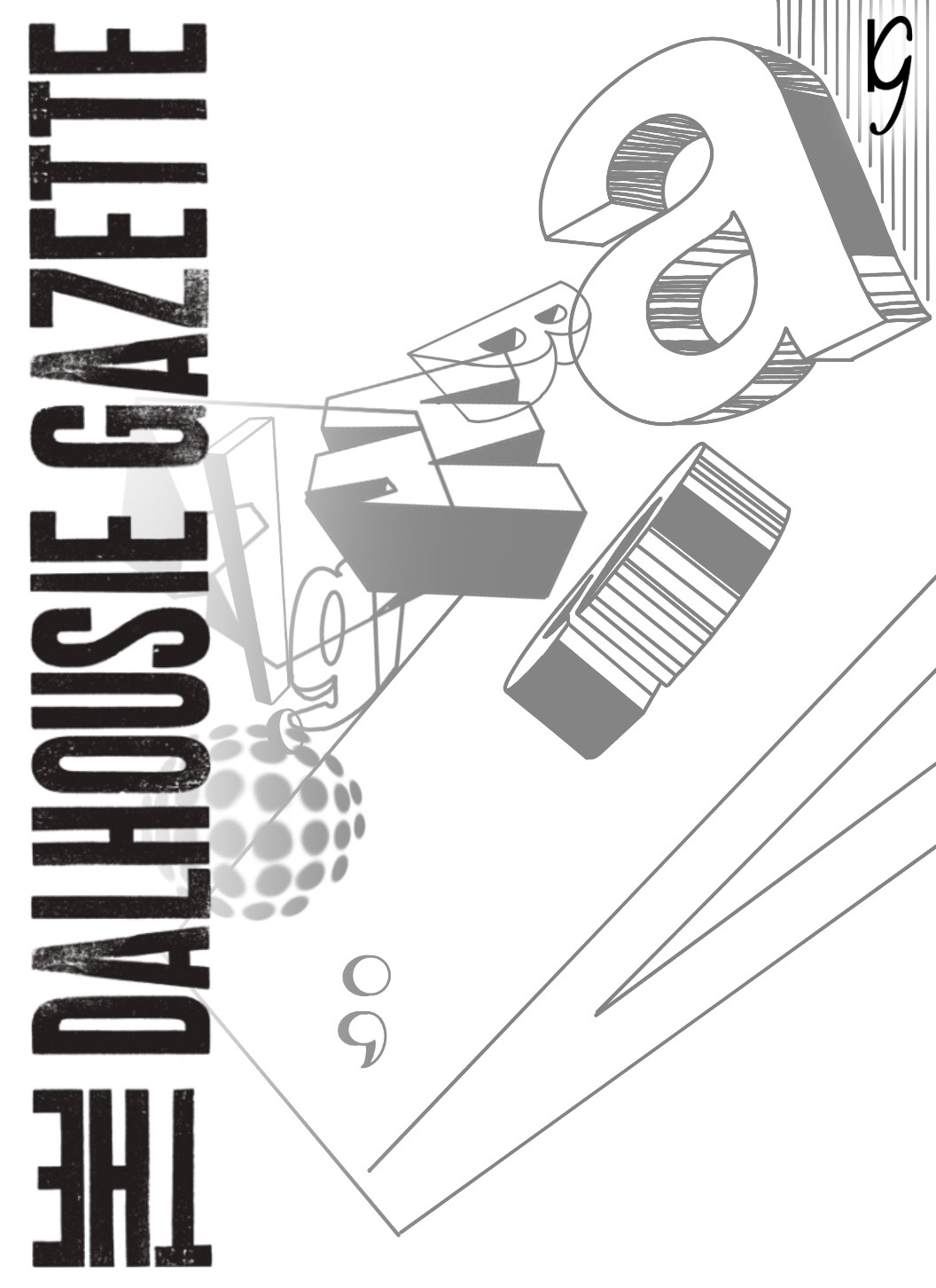
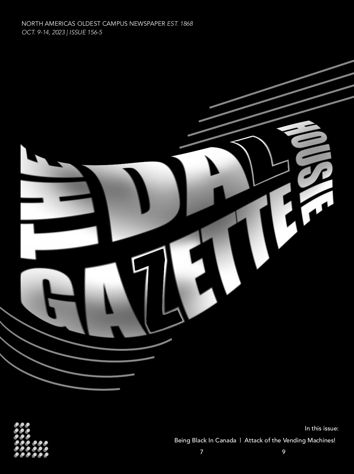
Selected Covers & Spreads ───────────────────────────────────────────────────────────────────
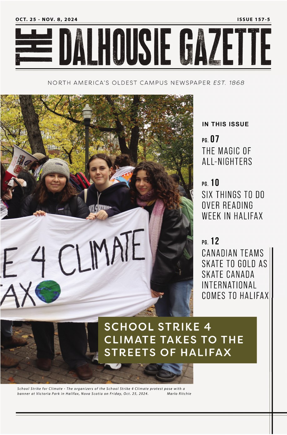
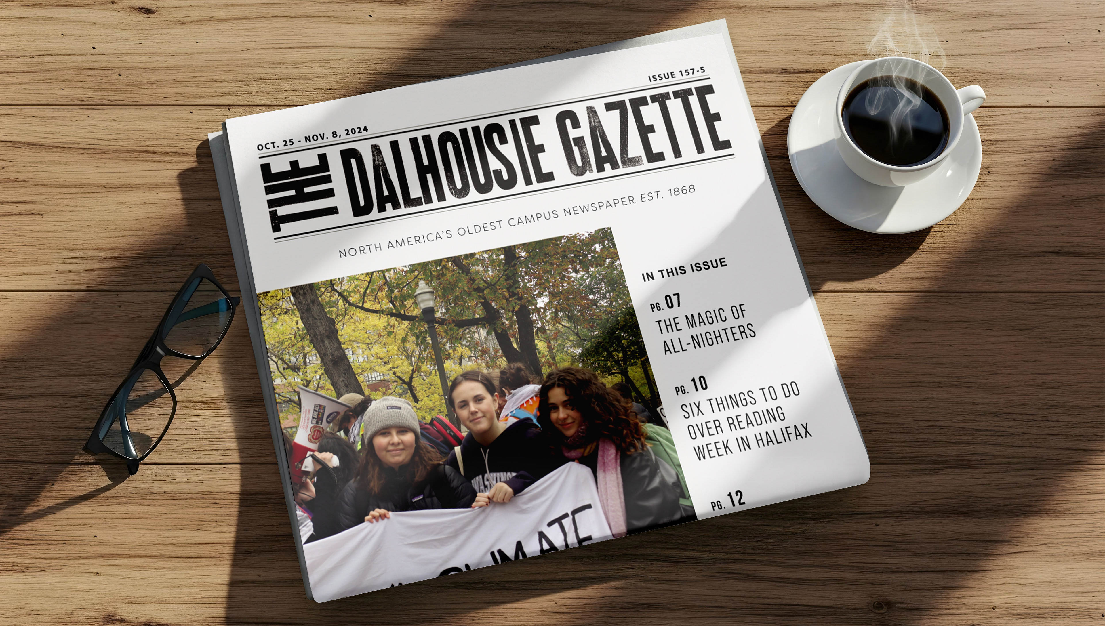
Spreads in Context, Social & Sketches ──────────────────────────────────────────────────────────────
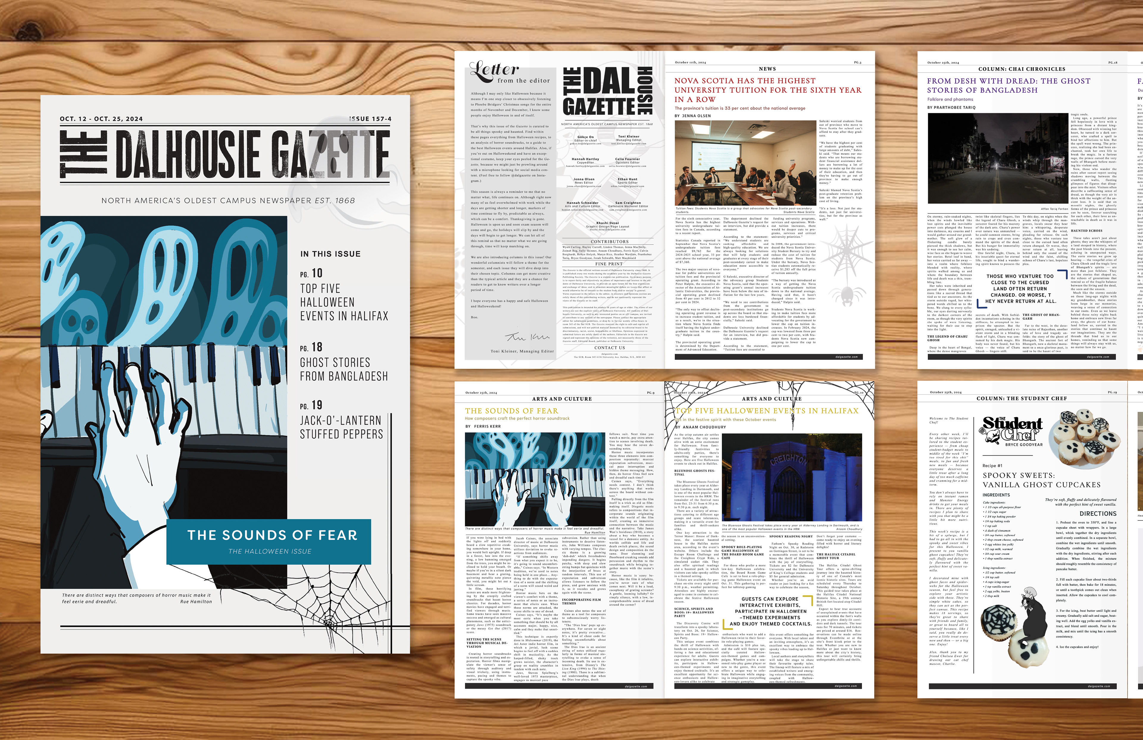
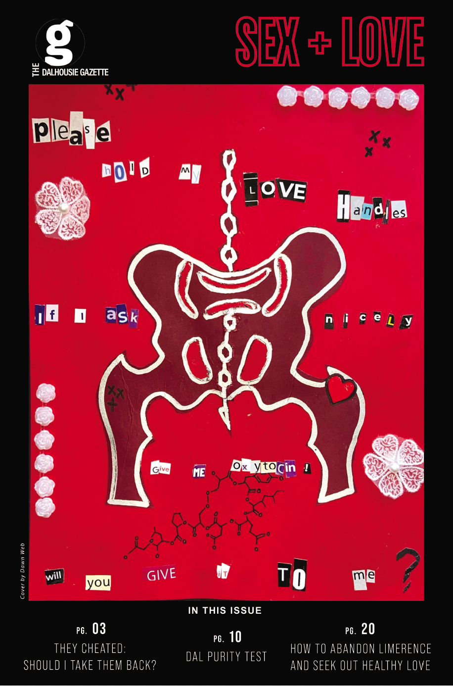
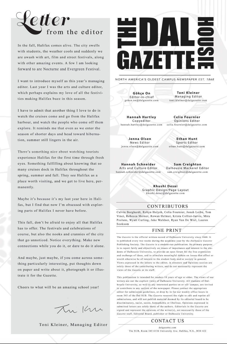
Across each issue, I managed multiple sections with distinct tones and visual rhythms, adjusting layout systems, typography, and pacing to suit different types of content while maintaining consistency throughout the paper. I designed a custom masthead including a custom logo, background and a dedicated Letter to the Editor page to establish a clear editorial voice and hierarchy. Four issues out of the year also featured a themed cover, supported by intentional inside layouts and section openers that carried the concept through the publication and reinforced cohesion across print spreads.